
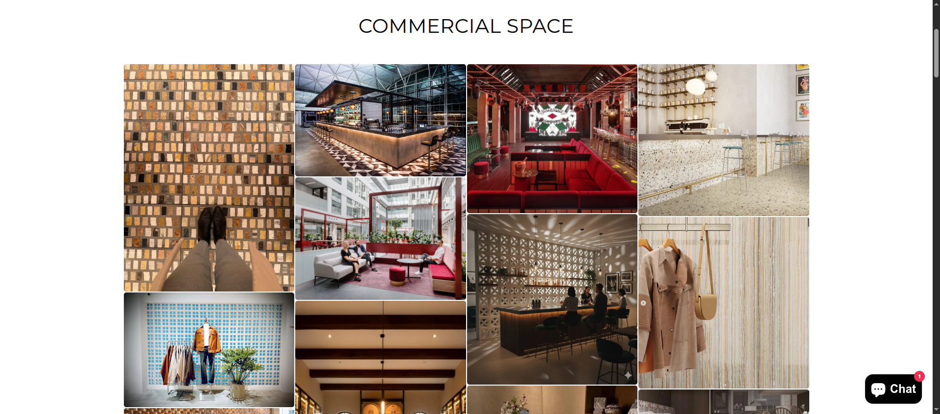
Custom Grid Section
Description
Custom Masonry Grid Section introduces a dynamic, asymmetrical layout that showcases content in a visually engaging, Pinterest-style grid. Instead of rigid rows, items are arranged in a fluid masonry structure, allowing blocks of varying sizes to fit together seamlessly and create a more editorial, modern presentation.
Fully customizable, merchants can control block sizes, image ratios, spacing, and layout behavior across desktop and mobile. The section supports a mix of content types—images, banners, links, and promotional blocks—making it ideal for storytelling, featured collections, or homepage highlights.
Designed for flexibility and performance, the grid adapts responsively while maintaining clean alignment and smooth loading, ensuring a polished experience across all devices.